Billy Sunday
Visual direction, brand voice, printed materials, website, content management system, & messaging for a cocktail bar
02 29 16

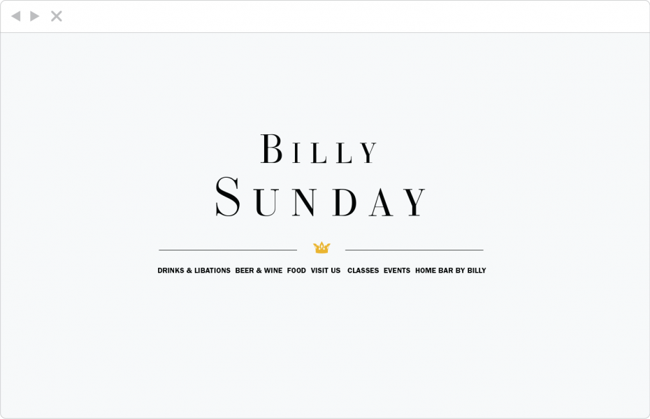
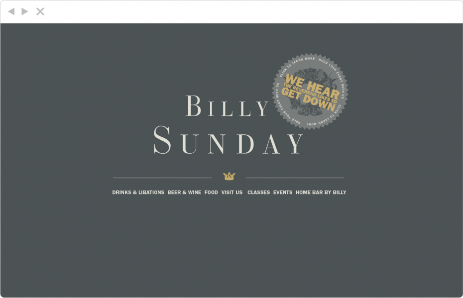
Initial homepage, very austere. The idea driving all of the Billy work was that it should look like turn-of-the-century journalism, to fit with the way the reverend Sunday himself played the press for headlines across the Midwest.

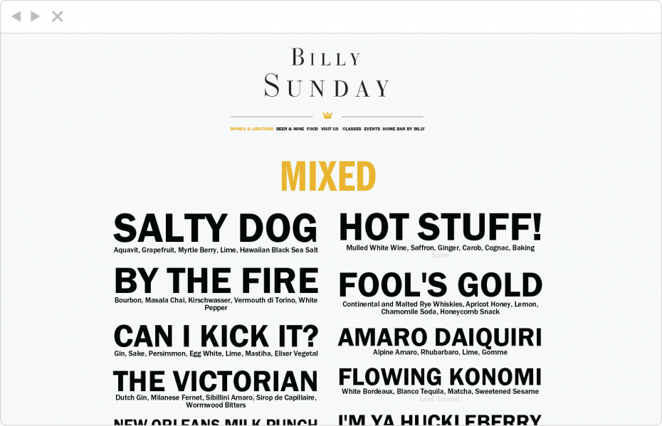
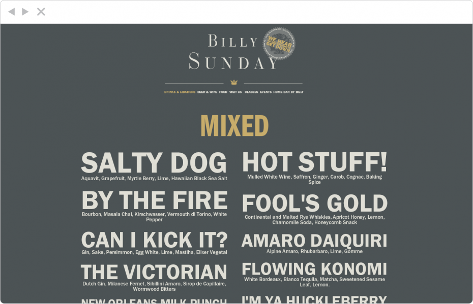
Initial menu. Menu pages were programmed so that the staff could easily create new page compositions within Wordpress with an easy drag & drop interface, and so that lines of text would automatically display in all caps, sized to stretch the entire width of the space.

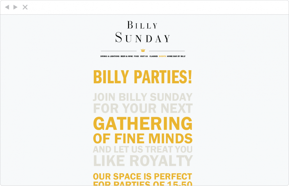
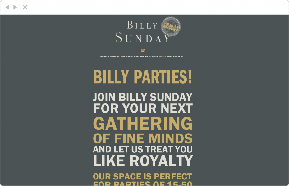
Initial group sales page. text pages were created so that staff could easily create custom page compositions within WordPress, with interesting visual emphasis and color change.

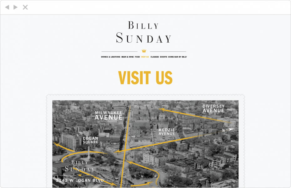
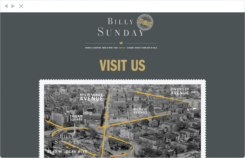
Initial contact page. Map is is custom-designed over a period-correct photo, unearthed through photo research at the Chicago Transit Authority.

Home, version two. In this version, austerity becomes a bit more decorative, with a deep gold & gray palette. This is where we also began emphasizing humor, making fun of Rev. Sunday, teetotalers, and the morality of the overly-pious Christian Temperance Movement.

Menu, version two. Menu pages were programmed so that the staff could easily create new page compositions within Wordpress with an easy drag & drop interface, and so that lines of text would automatically display in all caps, sized to stretch the entire width of the space.

Group sales, version two. Text pages were programmed so that staff could easily create custom page compositions within WordPress via drag-and-drop, with interesting visual emphasis and color change.

Contact, version two. Map is is custom-designed over a period-correct photo, unearthed through photo research at the Chicago Transit Authority.

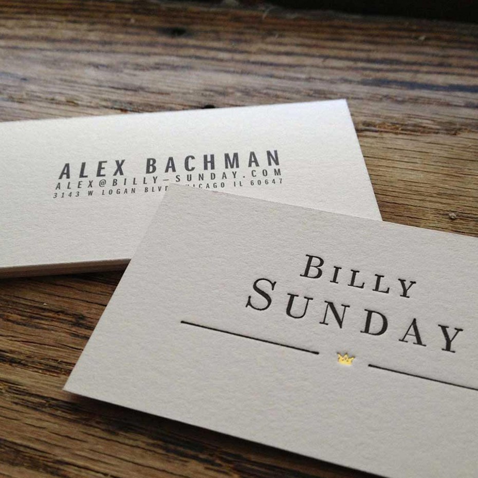
Cards are letterset & foil-stamped on one side, offset printed on the other, on 1/16" cotton stock.

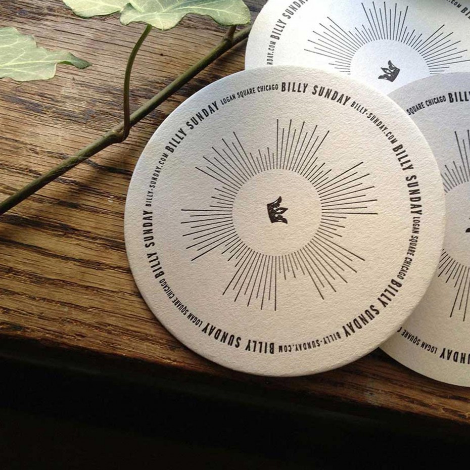
Coasters with custom patterning printed with single-color letterpress at
Accucolor.
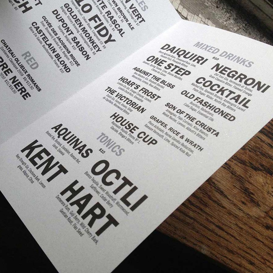
Typography for printed menus was designed to be identical to online menus.

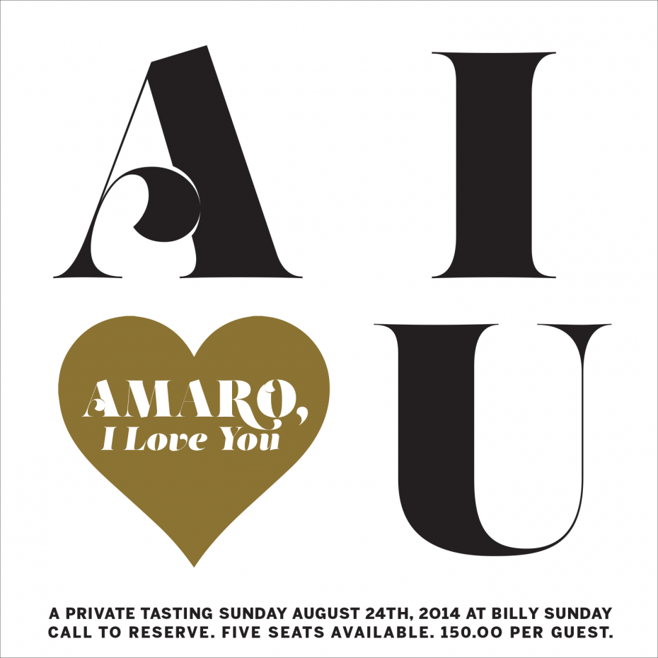
"Amaro, I Love You" is a series of limited-seat tastings of the Italian herbal liqueur.

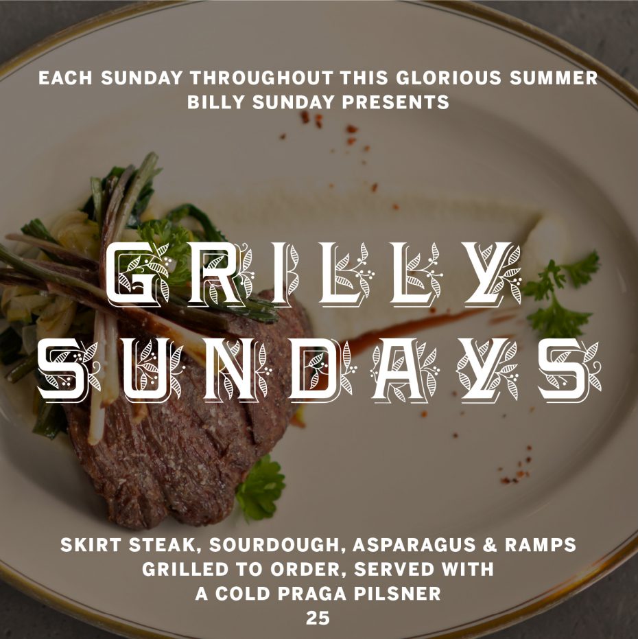
Grilly Sundays introduced the bar's punnier side for summer al fresco Sunday brunch.

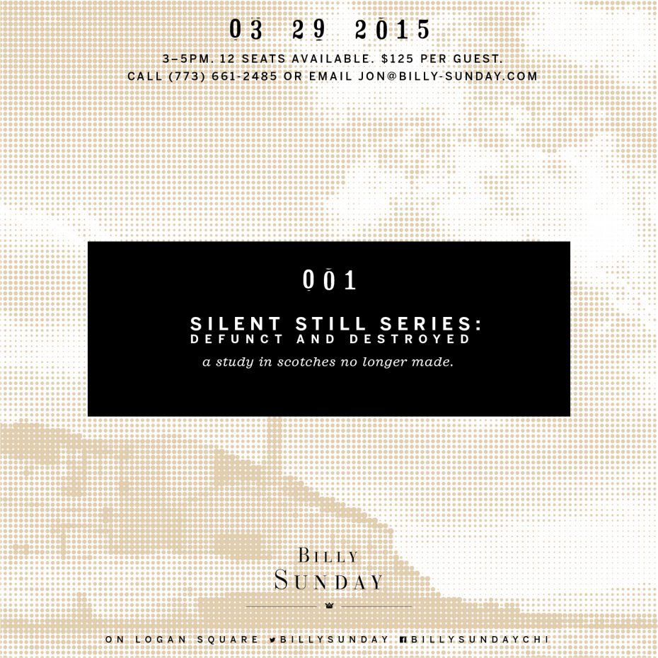
Silent Stills was the first of a very successful tasting series of extinct and rare Scottish whiskeys.

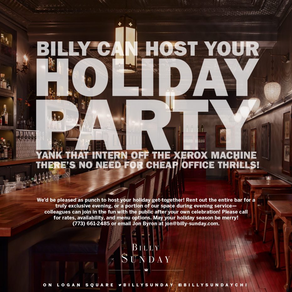
This announcement for holiday parties makes clear the bar's attitude towards the status quo.

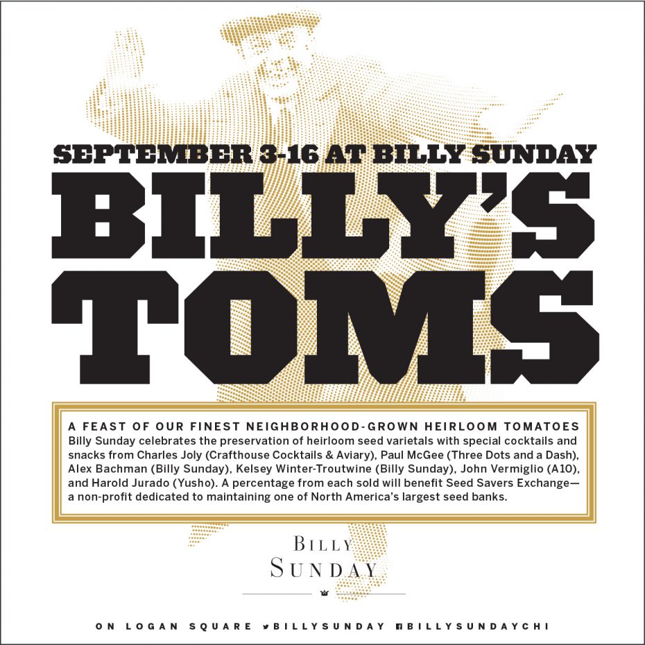
Billy's Toms is a yearly event with dishes & cocktails made from tomatoes grown in the bar's garden.
Billy Sunday is a cocktail bar from Chef Matthias Merges in Chicago’s Logan Square neighborhood, helmed by Creative Director and Jean Banchet Award-winner Alex Bachman,featuring pre-Prohibition cocktails and light fare. Pretty created Billy Sunday’s branding, sales materials, menu and events site, advertising and social media messaging, beginning with austere typography based on broadsheets and posters of the early 20th century. We developed the bar’s voice to be flip but knowledgeable—professionals with a sense of mischief. Billy’s menu design got a bit of notice in Grub Street, a nice nod to an element of the restaurant experience that usually goes ignored. The bar’s named after Chicago Enemy #1, the Reverend Billy Sunday, who criticized the city’s drinking habits endlessly (never mind his own widely-know adultery).
Project categories: Messaging, Brand Development, Code

